
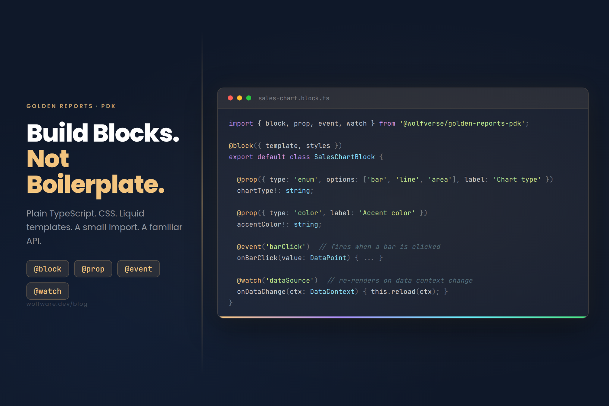
When you drag a Divider block onto a Golden Reports canvas, you're working with a TypeScript class. When you pick a chart type from the properties panel, that dropdown is powered by a decorator. Every block we ship is built the same way we want third-party developers to build blocks eventually.
Here's how it works.
Three Files. One Block.
Each block lives in its own folder with three files:
sales-chart.block.ts: the TypeScript classsales-chart.css: stylessales-chart.liquid: the HTML template
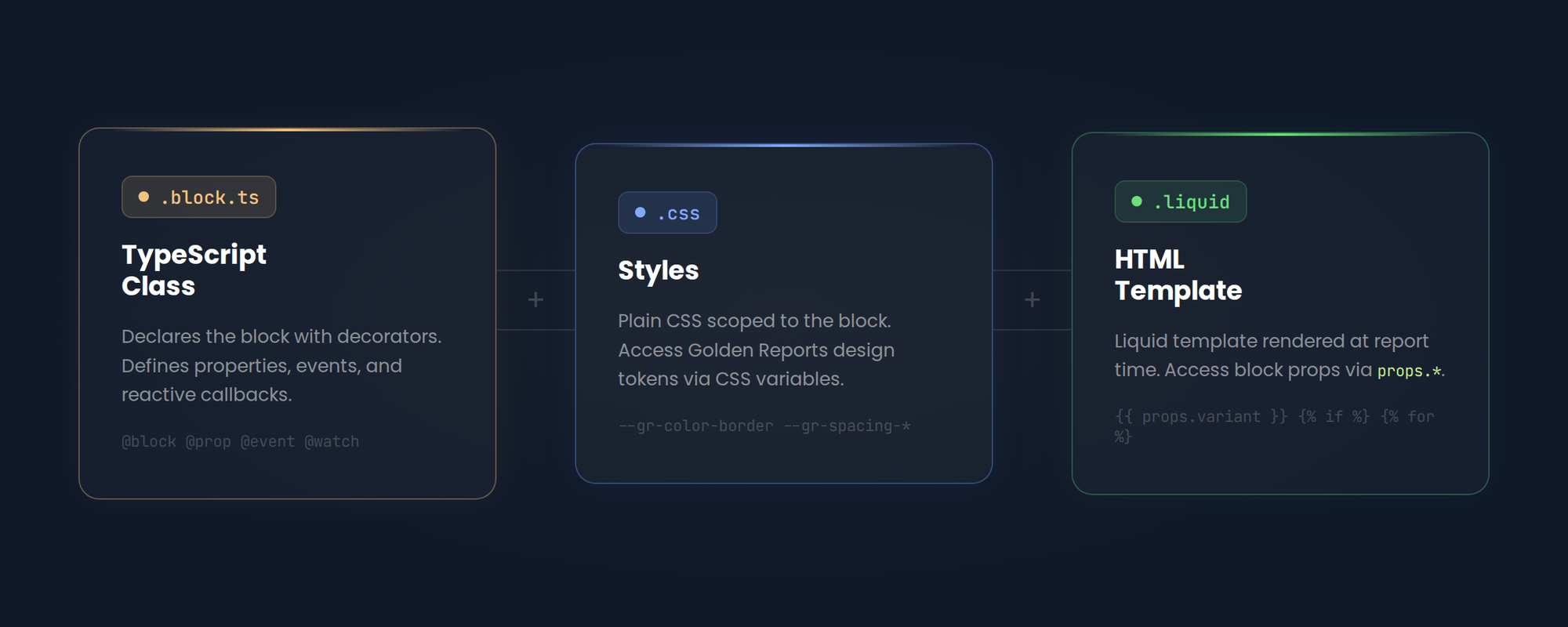
No module registration. No config files. The decorators on the class handle everything.
What a Block Looks Like
Here's the actual DividerBlock from our core package:
import { block, prop } from '@wolfverse/golden-reports-pdk';
import styles from './divider.css';
import template from './divider.liquid';

@block({ template, styles })
export default class DividerBlock {

  @prop({ type: 'enum', options: ['solid','dashed','dotted','double'],
          default: 'solid', label: 'Line style' })
  variant!: string;

  @prop({ type: 'enum', options: ['thin','medium','thick'],
          default: 'thin', label: 'Thickness' })
  thickness!: string;

  @prop({ type: 'color', default: '', label: 'Color' })
  color!: string;

  @prop({ type: 'string', default: '', label: 'Center label' })
  label!: string;
}
The @block decorator registers the class and wires up the template and styles. Each @prop becomes a field in the properties panel. The editor renders the right input based on the type.
The Four Decorators
| Decorator | What it does | When to use it |
|---|---|---|
| @block | Registers the class as a report block | Every block (required) |
| @prop | Exposes a property in the editor panel | Anything configurable |
| @event | Creates an event handler on the block | Handling events fired by the report editor |
| @watch | Reacts when a data context changes | Blocks that react to property changes that need to re-render |
The lifecycle side is familiar too. Blocks support onInit, afterViewInit, and onDestroy: the same hooks you'd use in an Angular component. If you've written Angular, you already know when to use them.
What Ships with the MVP
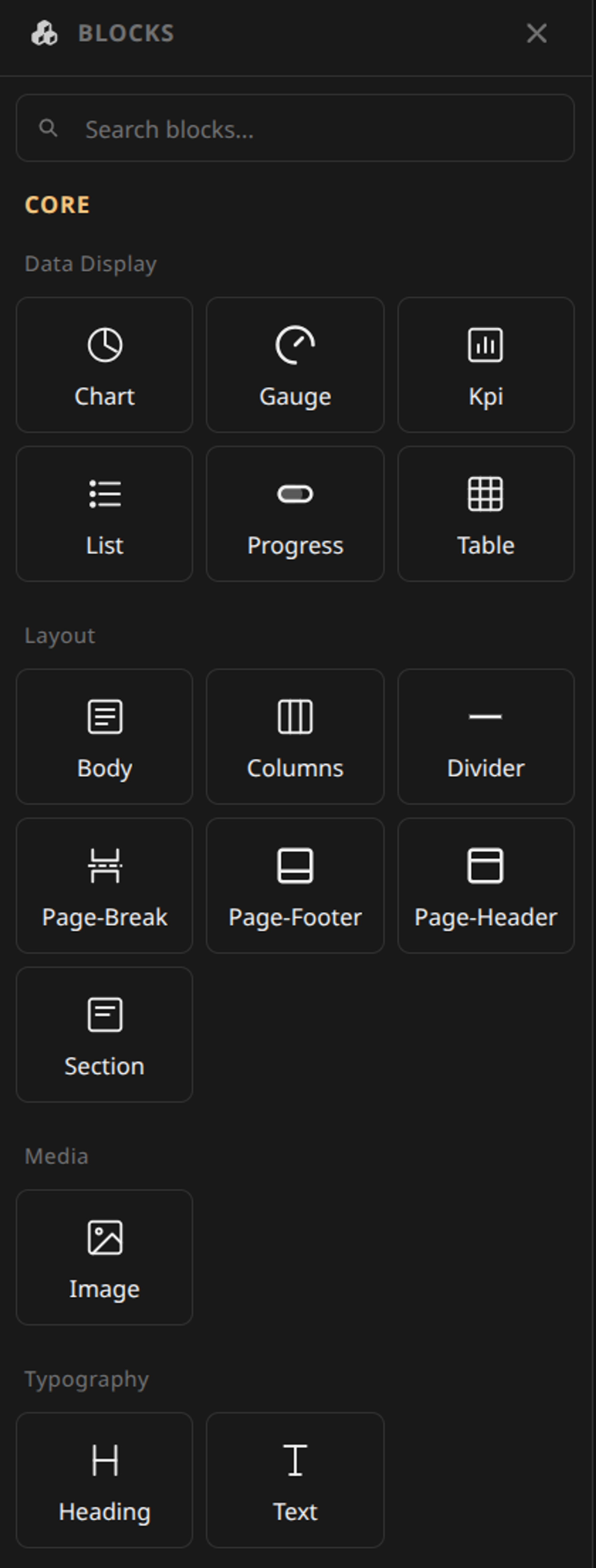
Custom block authoring isn't available yet. For the initial release, Golden Reports comes with a set of core blocks that covers the most common report needs:
| Category | Blocks |
|---|---|
| Data Display | Chart, Gauge, KPI, List, Progress, Table |
| Layout | Body, Columns, Divider, Page-Break, Page-Footer, Page-Header, Section |
| Media | Image |
| Typography | Heading, Text |
Third-party block authoring, custom packages, and a block marketplace are on the roadmap for later this year.
Why We're Sharing This Now
We build all our own blocks with this API. It works. It's not a concept or a prototype. It's what ships.
When we open up block authoring to third-party developers, this is what it'll look like. We wanted to share the direction now, even if you can't build your own blocks quite yet.
Golden Reports launches Early Access in May 2026. Join the waitlist at goldenreports.dev.
